Elements and Principles of Design
Elements of design are things that a designer can use to communicate ideas. They can be thought of as the building blocks of design. They include:
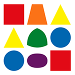 |
SHAPE |
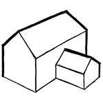
A Shape has two dimensions - Height and Width. |
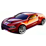 |
FORM |
A Form has three dimensions - Height, Width and Depth |
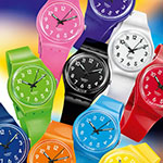 |
COLOUR |
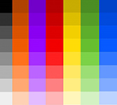
Colour is defined in many ways. We have Primary, Secondary and Tertiary colours.
They have properties - Hue, Value and Saturation.
Click here to find out all about COLOUR. |
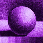 |
TONE |
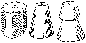
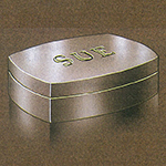
Tonal Shading is the method used to give a 2D object the appearance of 3D. By considering where Shadows and Reflections appear we can convey to the viewer the appearance of Depth.
Tones themselves are created by adding both black and white to a hue. |
 |
 |
LINE |
Many sorts of Lines are used in Art and Design. Some can be thought of as formal Line Types. These are used in things like Architectural drawings and plans.
Some can be thought of as less formal or Sketch lines (think of freehand sketching with a pencil)
Line styles, such as the Thick and Thin technique can be used to give a drawing a particular appearance. |
 |
 |
TEXTURE |
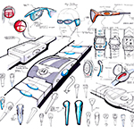
Texture is concerned with the surface quality of an object. It can be thought of as the Roughness or smoothness of the object and makes the viewer think about what that surface would feel like if you touched it.
Textures can be described as Tactile, meaning that if you rub your fingers over them you can actually feel them. (Thickness of paint strokes, collage materials etc.)
Visual texture can’t actually be felt but is suggested by the rendering of the image.
They can be created by reproducing the colour patterns of actual textures; darks and lights can be used tolook like tree bark or the three-dimensional roughness of a stone surface. Sometimes repeating marks, shapes or patterns are used to create the suggestion of a texture |
 |
SPACE |

|
The layout, alignment and size of objects can produce different results. E.g. a larger object will appear closer than a smaller one. |

|
Overlapping objects gives the appearance of depth. |

|
The appearance of distance can be created by changing the tone, size and opacity of objects. |

|
It can also be created using Perspective techniques |
Principles of Design provide methods for using the Elements. These principles are usually used in conjnction with one another. The most commonly used principles are:
|
Balance |

|
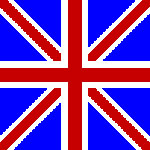
Balance deals with the equal distribution of what we see. The most common type is Symmetry which is basically where we see a mirroring (as in the map image). Symmetry is most commonly seen in architectural design. |

|
Asymmetrical balance is where different shapes that appear to have the same visual weight are mirrored or repeated. |

|
Radial balance is when all the elements radiate out from a central point and the visual weight is distributed equally. Radial balance draws the viewers attention to the center of the design. Good examples are Clock faces and Flowers. |
|
Contrast |
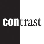
The concept of contrast says that if two items aren't the same, make them very different.
Contrast adds visual interest.
You can create visual interest by using colour e.g. Black / White or through size and weight (e.g. Font style and size). |
 |
Proximity
and Unity |
Objects that are near to each other are seen as a unit.
Sometimes when designing there is a temptation to fill up the entire page with text and images. This makes information difficult to digest and usually doesn’t look good.
The principle of proximity, suggests that you group together any items that have something in common, and separate those items that don’t. This makes things become clearer on the page. Proximity is a major consideration in Graphic Design, especially for things like Magazines, Phone Apps and Web sites. Don't be afraid of white space! |
|
Harmony |
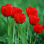
Harmony is thought to be the result of arranging specific colours together to get a 'feel' that seems correct. Take the image to the left for example. Nature often has a way of using colours that seem to compliment each other, thus achieving Balance.
Theoretically we talk about how we use the Colour Wheel to guide our choices. Sometimes we achieve Harmony by using colours that are opposite each other. The flower is a Warm colour wherase the Grass is a Cold Colour, yet together they seem correct, they seem 'balanced'
Harmonious Colours are next to each other on the Colour Wheel. They blend well together. This will be when you see shades of similar colours together. I imagine the sky meeting the sea - both can be Blue but they can be seen in Harmony if the right Tones are used. |
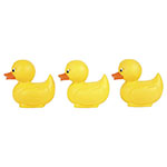
|
Alignment |
Alignment means that everything on a page should be visually connected to something else on the page. Nothing should be placed randomely, it should have purpose.
In Graphic Design this could be reflected in the way words and images are aligned. For example if everything is centred you naturally connect one thing to the next when you look at it from top to bottom (as we read!) |
|
Repetition and Consistency |
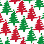
Repetition is used in many areas of design including clothing fabrics, wallpaper and wrapping paper. |
|


